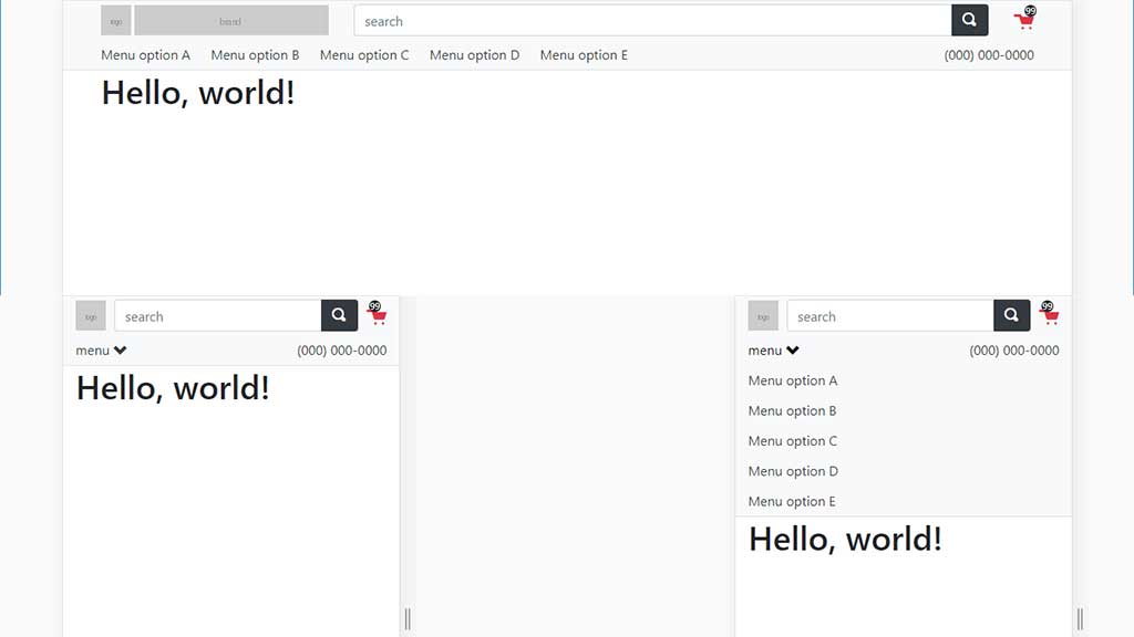
This sample lends itself to an ecommerce website.
Features:
*Search is always visible, even on small screens
*Product categories are visible on larger screens but need a click to view on small screens
*Shopping cart link is always visible
*Phone number is always visible
*On small screens just a small logo is visible, but on larger screens the website name is also visible
This template uses standard Bootstrap classes wheere possible, but requires a little extra CSS to achieve the end result.
Demo
Source code:
<!doctype html>
<html lang="en">
<head>
	<meta charset="utf-8">
	<meta name="viewport" content="width=device-width, initial-scale=1, shrink-to-fit=no">
	<link rel="stylesheet" href="https://stackpath.bootstrapcdn.com/bootstrap/4.2.1/css/bootstrap.min.css" integrity="sha384-GJzZqFGwb1QTTN6wy59ffF1BuGJpLSa9DkKMp0DgiMDm4iYMj70gZWKYbI706tWS" crossorigin="anonymous">
	<link rel="stylesheet" href="https://cdnjs.cloudflare.com/ajax/libs/open-iconic/1.1.1/font/css/open-iconic-bootstrap.min.css" />
	<title>Hello, world!</title>
	<style type="text/css">
		#header .row{margin-right:-5px;margin-left:-5px}
		#header .col,#header .col-auto{padding-right:5px;padding-left:5px}
		#header_top{height:46px}
		#header_logo_left{float:left}
		#header_logo_right{display:none}
		#header_cart{position:relative}
		#header_cart_qty{position:absolute;top:0;right:12px;font-size:11px;line-height:14px;background:#212529;border-radius:50%;color:#fff;height:14px;width:14px;text-align:center}

		#header_cart a{font-size:1.5rem;text-decoration:none}
		#header_cart a .badge{color:#fff}
		#header_bottom a{display:block;line-height:36px}
		#header_bottom a:hover{text-decoration:none}
		#header_nav{clear:both}
		#header .collapsing{position:initial;height:initial;overflow:initial;transition:initial}
		@media screen and (prefers-reduced-motion:reduce) {
		#header .collapsing{transition:initial}
		}
		@media (min-width: 576px) {
		#header .row{margin-right:-15px;margin-left:-15px}
		#header .col,#header .col-auto{padding-right:15px;padding-left:15px}
		#header_logo_right{float:left;display:block;margin-left:4px}
		}

		@media (min-width: 992px) {
		#header_menu_toggler{display:none!important}
		#header_nav a{display:inline-block;margin-right:20px}
		#header_nav{clear:none;display:block!important;float:left}
		}
	</style>
</head>
<body>

	<div id="header" class="bg-light border-bottom">
		<div class="container">
			<div id="header_top" class="row align-items-center">
				<div class="col-auto">
					<a href="#">
						<img id="header_logo_left" alt="" src="https://via.placeholder.com/36x36.png?text=logo" style="height:36px;width:36px;" />
						<img id="header_logo_right" alt="" src="https://via.placeholder.com/231x36.png?text=brand" style="height:36px;width:231px;" />
					</a>
				</div>
				<div id="header_search" class="col">
					<form action="/search" method="get" role="search">
						<label for="keywords" class="sr-only">search</label>
						<div class="input-group">
							<input id="keywords" name="keywords" type="text" class="form-control" placeholder="search">
							<span class="input-group-append">
								<button type="submit" class="btn btn-dark"><span class="oi oi-magnifying-glass" aria-hidden="true"></span></button>
							</span>
						</div>
					</form>
				</div>
				<div id="header_cart" class="col-auto">
					<a href="#" class="text-danger"><span class="oi oi-cart" aria-hidden="true"></span> <span id="header_cart_qty">99</span></a>
				</div>
			</div>
			<nav id="header_bottom" class="clearfix">
				<a id="header_menu_toggler" class="float-left text-dark" data-toggle="collapse" href="#header_nav">menu <span class="oi oi-chevron-bottom" aria-hidden="true"></span></a>
				<a href="tel:0000000000" class="float-right text-dark"><span class="icon-phone"></span> (000) 000-0000</a>
				<div id="header_nav" class="collapse">
					<a href="#" class="text-dark">Menu option A</a>
					<a href="#" class="text-dark">Menu option B</a>
					<a href="#" class="text-dark">Menu option C</a>
					<a href="#" class="text-dark">Menu option D</a>
					<a href="#" class="text-dark">Menu option E</a>
				</div>
			</nav>
		</div>
	</div>
	<div class="container">
		<h1>Hello, world!</h1>
	</div>
	<script src="https://code.jquery.com/jquery-3.3.1.slim.min.js" integrity="sha384-q8i/X+965DzO0rT7abK41JStQIAqVgRVzpbzo5smXKp4YfRvH+8abtTE1Pi6jizo" crossorigin="anonymous"></script>
	<script src="https://cdnjs.cloudflare.com/ajax/libs/popper.js/1.14.6/umd/popper.min.js" integrity="sha384-wHAiFfRlMFy6i5SRaxvfOCifBUQy1xHdJ/yoi7FRNXMRBu5WHdZYu1hA6ZOblgut" crossorigin="anonymous"></script>
	<script src="https://stackpath.bootstrapcdn.com/bootstrap/4.2.1/js/bootstrap.min.js" integrity="sha384-B0UglyR+jN6CkvvICOB2joaf5I4l3gm9GU6Hc1og6Ls7i6U/mkkaduKaBhlAXv9k" crossorigin="anonymous"></script>
</body>
</html>