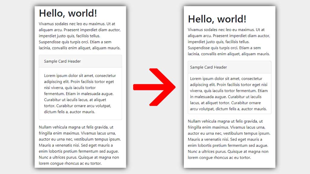
Bootstrap's card component looks good, but on small screen devices like mobile phones the extra padding takes up valuable space.
With a simple CSS addition you can reclaim some space and your cards will still look good.
@media (max-width:767px) {
	.card {
		border-left: none;
		border-radius: 0;
		border-right: none;
		margin-left: -15px;
		margin-right: -15px;
	}
}
This simply instructs that on any screen width up to and including the sm breakpoint, the card will take up 100% of the parent container width.
The left and right borders are removed, and rounded corners are also no longer desired.
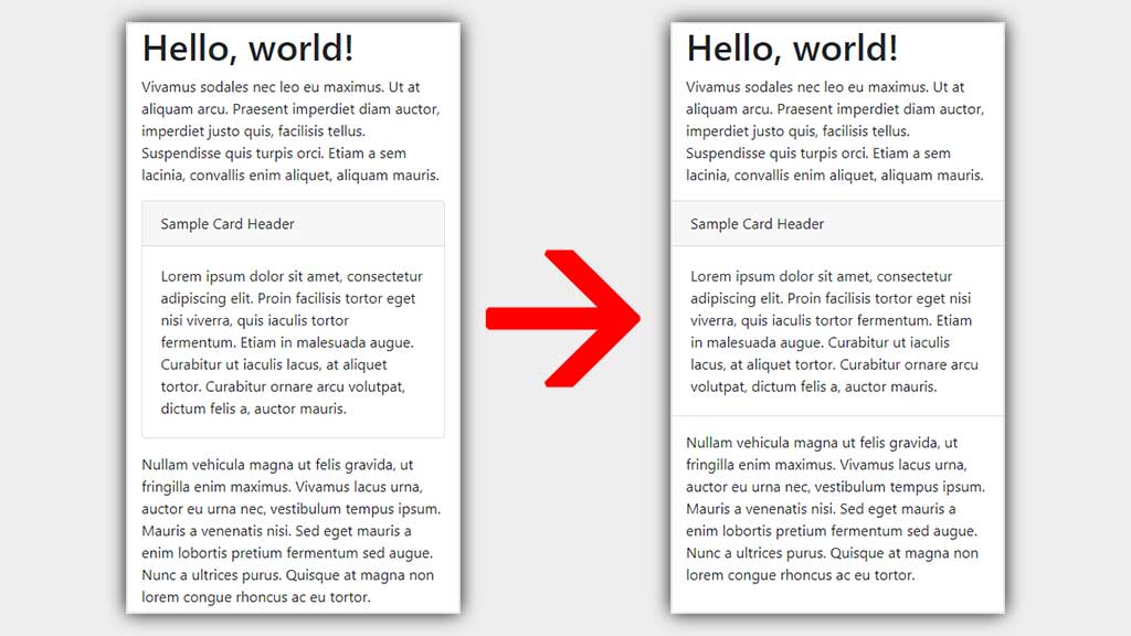
If you still want to retain the borders then you also have the option of saving a little less space and simply reducing the padding on the card-header, card-body and card-footer elements (no other CSS changes necessary).
<div class="card">
	<div class="card-header px-2">
		Card Header
	</div>
	<div class="card-body p-2">
		Card body
	</div>
	<div class="card-footer px-2">
		Card Footer
	</div>
</div>