More often than not, tables don't work very well on responsive websites when viewed on a small screen.
The Bootstrap 4 solution is to add a horizontal scrollbar at the bottom of the table, but on even a small table that often means going to the bottom of the table, scrolling horizontally, then going back up to find what you originally wanted to see... Not a very good user experience on mobile phones, which often account for at least 50% of users.
My solution is to use the Bootstrap 4 grid and cards to make a fake table, add some borders to make its purpose clear (and make it look nice), and add a little markup for accessibility.
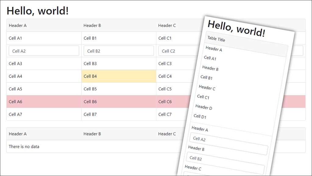
My fake tables look similar to normal tables on large screens but on small screens the header row is hidden and each row and cell collapses down into a label and data, like a Bootstrap form-group does.
This needs a little more markup than a normal table.
I also wanted the ability to mix text with form controls and buttons, and clickable rows - something that is hard to get right with normal tables.
The Markup
Instead of a table we use a div with the card class, but we add my card-grid class.
<div class="card card-grid" role="grid" aria-labelledby="gridLabel">
Our table header is the card-header. This hides on smaller screens and is replaced by a caption for our fake table.
<div class="card-header">
	<div class="row" role="row">
		<div class="col-md-3" role="columnheader">
			<p class="form-control-plaintext">Header A</p>
		</div>
		<!--more column headers here-->
	</div>
	<div id="gridLabel" class="card-grid-caption">
		<p class="form-control-plaintext">Caption</p>
	</div>
</div>
Our table body is the card-body and each row is defined simply by the row class.
Table cells are defined by any of Bootstrap's col classes. You can also achieve the equivalent of colspan's with your column sizing.
Putting your cell content inside an element with the form-control-plaintext adds a nice amount of spacing and also means if you add form-control and btn elements in other cells they will all be aligned.
I suggest using Bootstrap's text-truncate class so that content that doesn't fit is truncated. You may want to add a title attribute so that the user can see the full content on hover.
If you want hoverable and clickable rows, include an a element with the stretched-link class inside one of your columns. I suggest it not have any content but include a label for accessibility. In my example I put this as the last content in the row as I thought that made more sense for accessibility.
<div class="card-body">
	<div class="row" role="row">
		<div class="col-md-3" role="gridcell">
			<label>Header A</label>
			<div class="form-control-plaintext text-truncate">Cell A1</div>
		</div>
		<!--more cells here-->
	</div>
	<!--more rows here-->
</div>
Bootstrap's contextual classes for adding background colours to table rows and table cells also work nicely with my fake tables (eg. table-warning, table-danger, table-info, etc).
See the demo HTML source to see example markup.
CSS
.card-grid .card-header,
.card-grid .card-body {
	padding: 0;
}
.card-grid .card-header .row div[class^="col"],
.card-grid .card-body .row div[class^="col"],
.card-grid .card-grid-caption {
	padding-left: 0.5rem;
	padding-right: 0.5rem;
	padding-bottom: 0.25rem;
	padding-top: 0.25rem;
}
.card-grid .card-header .row {
	display: none;
	margin-left: 0;
	margin-right: 0;
}
.card-grid .card-body .row {
	position: relative;
	margin-left: 0;
	margin-right: 0;
}
.card-grid .card-body .row div[class^="col"] {
	position: static;
}

.card-grid .card-body .row div[class^="col"]:last-of-type {
	border-bottom: 1px solid #dee2e6;
}
.card-grid .card-body .row:last-of-type div[class^="col"] {
	border-bottom: none !important;
}
@media (min-width: 768px) {
	.card-grid .card-grid-caption {
		display: none;
	}
	.card-grid .card-header .row {
		display: flex;
	}
	.card-grid .card-body .row div[class^="col"] {
		border-bottom: 1px solid #dee2e6;
		border-left: 1px solid #dee2e6;
	}
	.card-grid .card-body .row div[class^="col"]:nth-of-type(1) {
		border-left: none !important;
	}
	.card-grid .card-body .row div[class^="col"] label {
		display: none;
	}
	.card-grid .card-body .row div[class^="col"] a.stretched-link:hover:after {
		color: #212529;
		background-color: rgba(0, 0, 0, .075);
	}
}
Note that the CSS includes padding and colours based on default Bootstrap 4 options. You should change these if you are not using the default values.
I am using Bootstrap's md (>=768px) for the breakpoint to switch from collapsed to table view. You can change this to whatever you prefer.