Bootstrap modals are great but on small screens they take up more valuable space than necessary.
With a few simple CSS tweaks you can maximise the available space and improve the look of modals on small screens.
The first thing to do is to remove the margin around the modal:
@media (max-width: 575px) {
	.modal-dialog{margin:0}
}
The media query with maximum width means this change applies just to the XS size.
With the margin gone, the border and rounded corners look weird so they need to be removed too:
@media (max-width: 575px) {
	.modal-dialog{margin:0}
	.modal-content{border:0;border-radius:0}
}
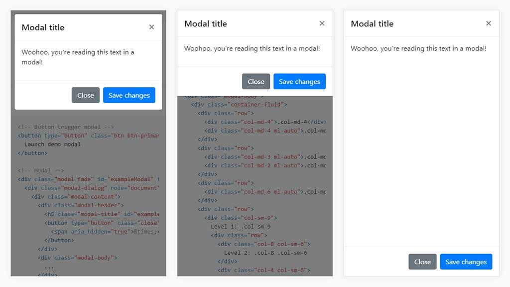
Now we have a much better looking modal that takes up the full width of the screen (middle screen capture on the attached image).
A further improvement that can be made is to make the modal take up the full height of the screen too:
@media (max-width: 575px) {
	.modal-dialog{margin:0;height:100%}
	.modal-content{border:0;border-radius:0;min-height:100%}
}
Here’s how these changes look compared to the standard Bootstrap style.
